
In this activity we play with colour! Through our investigations we will learn about the nature of colour, and discover how colour appears to change depending on the different lighting that falls on it, and depending on what colours surround it.
The activity develops from previous activities. So take a look at some earlier activities, before tackling this activity, especially if you have not done any already:
- Rainbows and Colours
- the activity to make a quick sketch before you code, an
- Hue Saturation Brightness activities first.
Activity 1. Evaluate and critique the pictures
Look at the photographs of the blackberries. They may bring back memories of searching for blackberries in the hedgerows. Perhaps making blackberry jelly jam at home. Possibly getting hurt by the thorns as you try to pick them.
But does this picture look right? Are the colours correct?
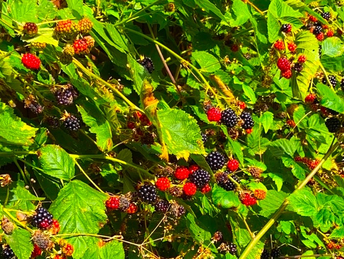
Consider these next four photographs of the blackberries photograph. Think about each of these photographs. Do these look better? Try to consider which is the correct one!
IA colour photograph of blackberries.(v1) 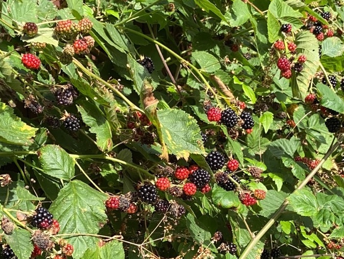
A colour photograph of blackberries.(v2) 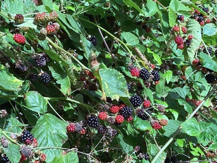
A colour photograph of blackberries.(v3) 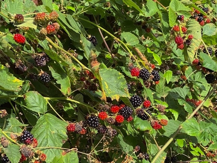
A colour photograph of blackberries. (v4)
It is not easy to decide which is the right one.
Actually there is no correct one! I took the photographs on a sunny afternoon. So the sun was quite bright, and consequently the colours would be quite right. But was the light more yellow, or white? V1 has rich vibrant colours, it looks like a very warm day. V2 looks like it was an overcast day, with the sun shining through the clouds. V3 perhaps could be a bright day, but not in direct sunlight. V4 is a warm day, but not as warm as v1.
In actual fact, the original is v2. But the photograph was made by a camera, with particular settings, and processed by the camera’s computer. In other words, the camera had to choose how to process the light into colours and how to store it. Furthermore, the appearance of the images will depend on the computer screen you use to view them. Your computer screen will have different settings, to change to warmer colours, colours that are more blue , darker or lighter colours, and so on.
What colour are the leaves? What colour is the berry?
We can evaluate the image through an image processing application.
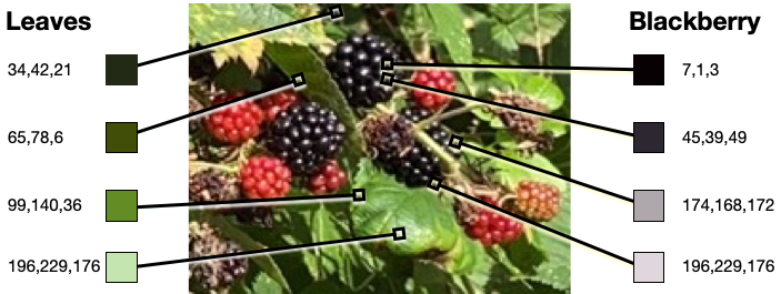
We find that the leaves have a broad range of green hints. From dark green to light green. For instance, the position underneath the leaf is in shadow, and consequently the colour appears dark green: RGB(34,42,21). While the top of the leaf is not in shadow, and is a brighter green RGB(99,140,36). The part of the leaf that is in directly in the light is brightest still, RGB(196,229,176). The leaf changes colour; depending on whether it is in shade or bright light.
Likewise, the ripe blackberry has colours that appear black to grey. The range from dark black RGB(7,1,3) to a light grey RGB(196,229,176). While the blackberry is (well) black all over, some parts catch the light and act as small mirrors. Some parts reflect light very well. The berry segments that reflect the light well, catch our eye, and appear as small jewels glistening in the light.
What does this tell us?
This tells us a few things. First, colours can be identified by us, and measured and classified. Second, how we view and perceive colours depends on the environment they are displayed within: Third, colours are emotive.
Activity 2. Name colours and think about how they are measured
Let’s do a quick activity. Try to name the following 10 colours. Go through each one and name them.
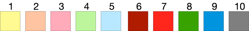
Working through 1 to 10, you may go as follows: “Yellow, well that was easy”, then you hesitate. You think to yourself “what is this colour, is it orange, maybe pink-orange, perhaps salmon? Let’s call it salmon”. Now you move on, it’s a little more easy. You say “pink”, then “green, blue and red”. Now you hesitate. “Is 7 red, if 6 is red”, so you perhaps decide that “6 is dark red, and 7 is red”. Then “green, blue and grey”. But then you realise that you said that 4 was green and 8 also green and named both 5 and 9 blue. Perhaps you adjust 8 to be dark green, and 9 to cyan.
What’s the point? Well, unless there is a clear idea, then naming the colours are not possible.
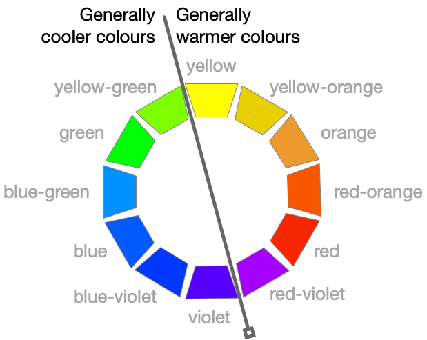
Goethe proposed a useful strategy. Goethe separated the colour wheel into 12 parts; with yellow, red and blue separated in an equilateral triangle. This gives us a clear way to name the colours. Follow the convention of primary colour first. We can get Yellow, Yellow-orange, orange and so on.
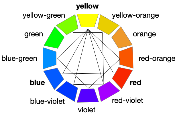
Using Goethe’s 12-part colour wheel we can easily observe the primary colours: yellow, red and blue. And observe orange, violet and green. Tertiary colours can then be named. Following the convention of the primary colour first, we can name yellow-orange, red-orange, red-violet, blue-violet, blue-green and yellow-green.
Top tip.
Name primary colour first.
E.g., blue that is more violet becomes blue-violet
If we were to mix paint to create these colours, we could move a red colour into something that looks more red-violet. A person with normal vision would identify a blue as a blue, and not a red. And a blue that is neither greenish or pink. But when is a red a red, and not an orange or red-orange. Potentially we could go higher elements, but it would be difficult to visualise and name all these different colours.
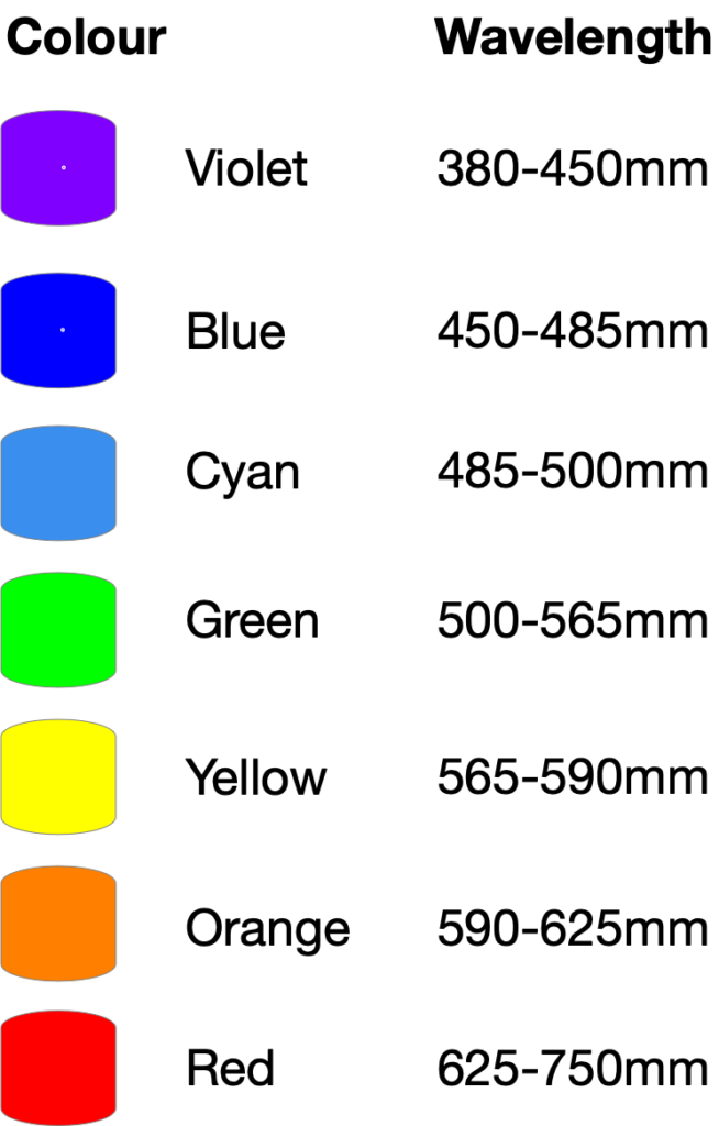
Rather than naming individual colours, we could measure the lights in terms of their frequency. The human eye can typically perceive different wavelengths between 380 to 750 nanometers. Sir Isaac Newton split white sunlight into the spectrum of colours, and we can name each hue in terms of its wavelength or frequency.
But colours we see are because that object has absorbed all other colours. So we could say “we see a red chair”. But this pot is only red, because at a molecular level, the surface of the chair has absorbed all light rays except for the reds. The chair does not really have a particular colour, instead it is the light around it that generates the colour.
“I think it is a waste of time for the colourist to practice making 24-hue, or 100 hue, colour circles. Can any painter, unaided, visualize Colour No.83 of a 100-hue circle?“
Johannes Itten writing in Elements of Colour
Johannes Itten, in his book The Elements of Color, explains that this is “colour agent”; the naming and defining of a colour. We can evaluate a colour and define it in terms of its wavelength and reflectivity. We can look at paints and measure the mixes, to create physio-chemically accurate colours. But it is not only about naming colours, or measuring them, but seeing how they appear.
Colour agent (as named by Johannes Itten) represents the colour that it is,
e.g., as measured by the computer, or stored in a file.
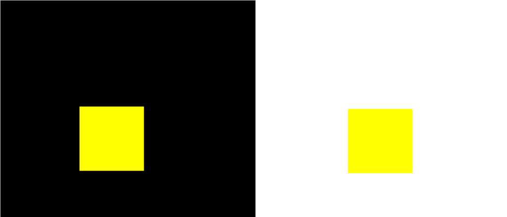
Look at the coloured red and blue blocks. What do you see? Are some darker than others?
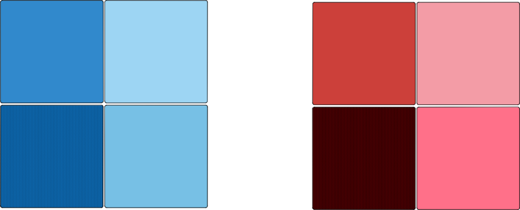
Each of the blocks have a different colour interval. The rectangles along the top show a dramatic change. While those vertically show a more subtle interval.
Consider the next six blue squares. Name their value.

Probably you looked at the whole six squares and said that the left one was 100% and the one to the right was zero. You would probably allocate an equal amount of value to the interval between each, and the brightest got the higher value and the white the lowest. Possibly 100%, 80%, 60%,40%, 20% and 0%. This seems sensible. In fact, this matches with how the image was created – as we altered the levels of saturation.
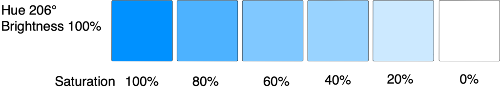
However, what if we said that we tricked you. And the quantity of coloured squares is different.
What would you think now?
Would you change your mind on the values you allocated?

Probably you would change your mind. You would allocate the maximum value to the dark black, and the minimum value to the white.
So what is the moral? There are several lessons we can learn:
- First, it is certainly possible to allocate values to colours. We can imagine colours in terms of value. This is useful. Not only does it help us to find the ripest berries in a berry patch, but we can also use them to create plots and charts, and understand values on maps!
- Second, it is not always easy to allocate values. We really need to view the range of values on offer, to decide on their respective values. This is why we need to see a colour legend in a map – so that we can understand individual values.
- Third, we need to see the full range of colours, to decide on the range of values. Indeed, we see colours in comparison to other colours.
- Fourth, it is not easy to allocate accurate colours. Especially if those colours are far away, or adjacent to different colours. As we shall see next, our perception of colours change depending on where they are located.
Activity 3. Judge colours in comparison to where they are located.
We have already looked at this challenge with the blackberry photographs (see above in step 1). We have already discovered that colours look different depending on how much light falls on the surface and how they reflect light.
To look deeper into this challenge; look at the following set of ten colours. Now name the coloured squares (on the black background) numbered 1 to 10.
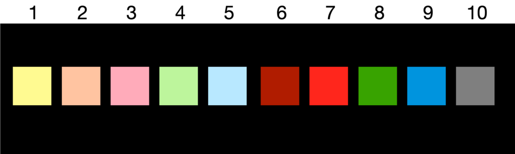
Working through 1 to 10, our thoughts may go as follows. “Yellow, salmon, pink, light green, light blue, dark red, magenta, green, cyan and grey”.
It is interesting. We have probably named these colours differently to the previous 10 colours we named in Step 2.
However, these coloured rectangles have the same RGB values as before.
Even if we put the images close together, our mind struggles to perceive the same colours. We see the colours differently, if they are on a white background in comparison to the black background. For example, rectangle 5 looks much lighter against the dark background. Rectangle 9 looks warmer on the dark background.
“Psychophysiological colour reality is what I call colour effect” [Itten]
It is how the colour looks to us.
Johannes Itten, The Elements of Color
Our eyes make decisions on the colours based on what colours surround it. We perceive colours (in our mind) through comparison to other colours, and in contrast to other hues. Johannes Itten names this “colour effect”.
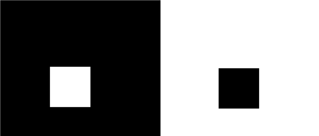
If we see a white square on a black background, it will look larger than a black square (of equal proportions) on a white background. The black contracts, whereas the white stands out.
When observing a yellow square on white or black background. On a dark background the yellow appears more brilliant and bright, whereas on a light background the yellow square looks darker, and perhaps feels more warmer.
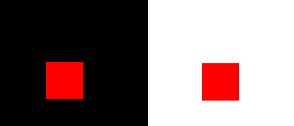
The red square looks darker on the white background, and perhaps more luminous and a warmer colour on the black background.
Activity 4. What emotions do colours evoke?
Look at these pictures of Caernarfon Castle. Which photograph looks like it was taken on a warm day? Was it hot or cold, when the photograph was taken?
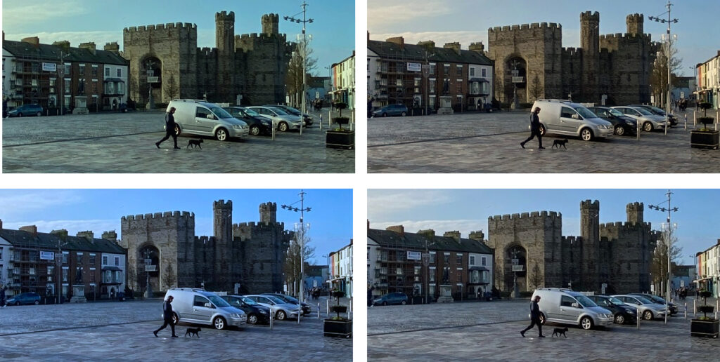
Photographs evoke feelings and emotions. The colours in these photographs may evoke warm colours, or colder contrasts. Perhaps things that appear dull may seem to be more distant objects. They may appear colder. A photograph of a warm summer day may contain yellows and oranges. In contrast a colder day may be dull, and dark. Again these are contrasting colours – cold to warm, sun to shade, far and near, wet and dry – our mind observes these differences.
In broad terms we can say that the tints that are red to orange are warm, while the blues to greens feel colder. There is a cold-warm contrast in the polar extremes of the 12-part colour wheel. This is obviously a huge generalisation, as the perception of colours depend on many things, especially nearby colours, how they are lit, what people have already said about the photograph and so on.
One particular effect is that our brain spontaneously requires the complementary colour, and we imagine it there when it is not. For example, when looking at a black square on an area of red, the square will appear greenish grey. Or if the square is blue, orange. Or with a violet square then yellowish. In other words, the mind has simultaneously generated the complement colour. This is simultaneous contrast.
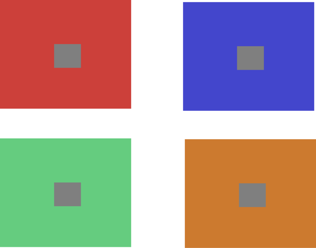
With a grey square of matching brilliance to the background, appears on a block of bold colour. The grey square appears tinted with the colour of the complement of the block of colour.
Activity 5. Do your own research.
There are many situations where colour changes are used to affect mood. Do your own research and find some movies where colour change is clearly being used.
For example Disney’s Toy Story 3, uses lighting to engender different moods. The colours are used to drive the emotional arc of the movie. Bright and vibrant colours are used for the logo, when the toys are happy (when they first arrive at the day care centre) the windows are open, with lots of light, soft shadows, and the colours are bright. When the mood changes, and the toys are worried, the colours of the scene is more red, with harsh shadows. When the nursery looks like a prison, a grey colour pallet is used.
Want to look further?
Take a look at work by Swiss artist Johannes Itten (1888-1967). For example, take a look at The Elements of Color: A Treatise on the Color System of Johannes Itten, Based on Itten’s Book “The Art of Color” Hardcover – 31 Jan. 1970 · ISBN-10. 0471289299.
Have a look at the work by Josef Albers. There is a lot of information on the Albers’ foundation website. Or pick up a copy of his book “Interaction of color”.