
In Cameron’s earlier post we learned how to create an animated rainbow with D3.js and SVG. What if I told you it was possible to create an animated rainbow without any JavaScript at all? In this guide you will learn how to create an animated rainbow using only HTML and CSS.
To jump straight into the final code, remix the demo on Codepen.
Here’s what we’ll be creating:
See the Pen Project Rainbow: Pure CSS Rainbows (Single element) by Peter Butcher (@pbutcher) on CodePen.
What is CSS?
Cascading Style Sheets (CSS) are responsible for adding colour, format and fonts to our webpages, and so much more. Powering this flamboyance is a feature rich language, which amongst other things, allows us to create fast and fluid, hardware accelerated animations and transitions.
Typical use cases for CSS transitions are user interactions on buttons, pull out menus and animations (spinners/loaders) to let a user know that their content is loading. The latter is a possible real-world application for what we are about to create. Mainly though, this is just a bit of fun to demonstrate some of the capabilities of CSS that you might not be aware of.
Getting Started
We are going to be using a CSS preprocessor called Sass (Syntactically Awesome Style Sheets). Sass like most other CSS preprocessors provides additional syntax features, making it easier to create more complex effects in CSS. Sass requires a compilation step to generate CSS that the browser can understand. Therefore it is normally necessary to integrate it into your build pipeline. There are a few ways to integrate Sass into your projects, including the node-sass NPM package if you prefer to work offline, or low-friction online IDEs which support Sass out of the box such as CodePen.
For this tutorial we will use CodePen to create our rainbow animation.
Step 1: Create a new Pen
First we need to create a new Pen and tell CodePen to interpret our CSS as Sass so that it knows to compile it before presenting our output to us. You can either use this pre-made template or follow these instructions:
- Create a new Pen
- Click the settings cog at the top of the CSS panel.
- From the CSS Preprocessor drop-down menu, choose SCSS.
You’re ready to go!
Step 2: HTML
We’ll start off by writing two lines of HTML, the only two lines we’ll need to create both of our rainbows.
Go ahead and open up the HTML panel of your Pen and add the following two lines of code:
<figure class="rainbow bands"></figure>
<figure class="rainbow smooth"></figure>
Each of our rainbows will be rendered inside these <figure> elements. We have defined the following classes which will allow us to add custom properties to each of our figure elements:
enfysRender a rainbowbandsGive a rainbow individual colour bandssmoothGive a rainbow a colour gradient
By combining these classes together we can define both types of rainbow.
That’s it for the HTML!
Step 3: CSS Boilerplate
Next we need to set up our scene. To do that we need to set a few properties of the page itself. CodePen adds our code to an HTML page before rendering the output. The basic structure that it generates looks like this:
<html>
  <head>
    <!-- Our CSS is inserted here by CodePen -->
  </head>
  <body>
    <!-- Our HTML is inserted here by CodePen -->
  </body>
</html>
We therefore need to add some CSS to style the <html> a <body> elements because they contain our content and we want to control how those look on our page. Add the following to your CSS:
html, body {
  margin: 0px;
  height: 100%;
}

body {
  display: flex;
  justify-content: space-evenly;
  align-items: center;
  flex-flow: row wrap;
  background-color: $background-colour;
}
The first CSS code block targets the <html> a <body> elements and sets some mutual properties for both. It removes a small margin around the edge of our page that we do not normally want and ensures the elements containing our HTML code will fill the whole height of our browser window.
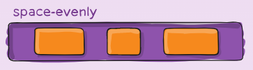
The second CSS code block only targets the <body> element. This block specifies that we would like to use the Flexbox Layout (display: flex) module on our page. Flexbox lets us lay out and align items on our page in a more “flexible” way, distributing space around or between items more efficiently. In this case we want to allocate an equal spacing around and between each of our rainbows and so we will use justify-content: space-evenly to split the remaining available space between each of our items horizontally.
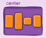
flex container when we use justify-content: space-evenly [Source]To place our rainbows in the centre of our screen vertically we need to use align-items: center.
flex container when we use align-items: center [Source]To allow our rainbows to wrap underneath each other (like text) when the screen becomes too narrow to fit them both on one line we can specify the flex-wrap: wrap CSS rule. Lastly we encounter our first piece of Sass syntax when we are setting the background-color property of our page. See the next step for an explainer on what’s happening here. For further information on Flexbox, refer to this handy guide by CSS Tricks.
Step 4: SCSS Variables
The latest version of CSS (version 3) now supports variables. A variable is a reference to a value that you can use throughout your code:
:root {
  --rainbow-diameter: 300px;
}

.rainbow {
  width: var(--rainbow-diameter);
}
Our CSS pre-processor has a different way of specifying variables and this is how we will specify variables in our Pen:
$rainbow-diameter: 300px;

.rainbow {
  width: $rainbow-diameter;
}
In SCSS, each variable is defined with the $ symbol and can be globally scoped (as above) or block scoped (inside a CSS declaration block { }).
We are going to need global variables for the following properties of our rainbow animation:
- Rainbow diameter (total width of each rainbow arc)
- Rainbow thickness (distance from inside to outside of rainbow arc)
- Animation duration (how long our animation will last on each cycle)
- Background colour (the background colour of our scene)
- Rainbow filter (post-processing filters to improve the visual appearance of our rainbows)
- Rainbow opacity (transparency factor of our rainbow)
- Rainbow colours (a list of each of the colours of the rainbow)
At the top of your CSS add the following code:
/* Variables (Play with these) */
$rainbow-diameter: 300px;
$rainbow-thickness: 60px;
$animation-duration: 6s;
$background-colour: #1A3256;
$rainbow-filter: hue-rotate(-15deg) contrast(95%);
$rainbow-opacity: 1;
$rainbow-colours:
  #FF0000, // red
  #FF7F00, // orange
  #FFFF00, // yellow
  #00FF00, // green
  #0000FF, // blue
  #4B0082, // indigo
  #9400D3; // violet
Once we have completed the tutorial, you will be able to modify these variables to fine tune your rainbows.
We will also need 2 more variables which use some of the variables we have already created. These are mainly for convenience later on and shouldn’t be changed:
- Rainbow radius (half of our rainbow diameter)
- Colour band width (width of each colour band of our rainbow)
Add the following 3 lines of code under the current set of variables:
/* Leave these alone */
$rainbow-radius: $rainbow-diameter / 2;
$colour-band-width: $rainbow-thickness / length($rainbow-colours);
Mae'r $colour-band-width variable uses the SCSS length() function to return the number of elements in a list. In this case the returned length will be 7 (the number of colours in our $rainbow-colours variable). This variable is important because it stipulates how thick each of our rainbow colour bands needs to be.
Step 5: Mixins
Now that we have defined all of our global variables we can begin to draw our rainbows using the properties we have defined. In the demo at the top of this page you can see two styles of rainbow. The first has solid bands of colour and the second is a smooth radial colour gradient. Both of these styles are considered gradients in CSS and are created in much the same way. Instead of hard coding each style of gradient we will write a special function called a mixin which can be used later on in our code to draw the rainbow in our scene.
First we will construct a mixin called rainbowGradient. Much like functions in other programming languages, mixins can accept arguments and so ours will accept an argument $type (the type of rainbow, either bands or smooth).
Add the following code under your variables:
/* Generate a rainbow gradient */
@mixin rainbowGradient($type) {
  // Generate rainbow gradient here
}
This is where we will write our code to generate each of the rainbow gradient types. It will return a set of CSS properties including a cefndir property with our rainbow gradient.
To use a mixin you use the @include directive inside a declaration block to inject the properties it generates. We will do this later.
Step 6: CSS Gradients
There are two types of colour gradients available in CSS:
- Linear gradients (up, down, left, right or diagonally)
- Radial gradients (from a central position outwards)
To generate a simple rainbow texture in CSS we can use either of these two methods:
For this exercise we will use a radial gradient as we need the rainbow to form an arc. Our gradient will also need to make use of what are known as colour stops so that our gradient can begin and end at fixed distances. This will give the appearance of an arc.
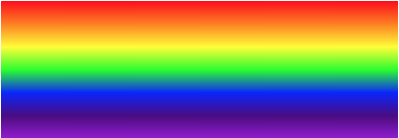
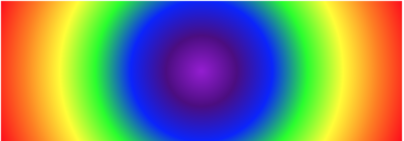
The gradients we will generate will look like this to begin with:
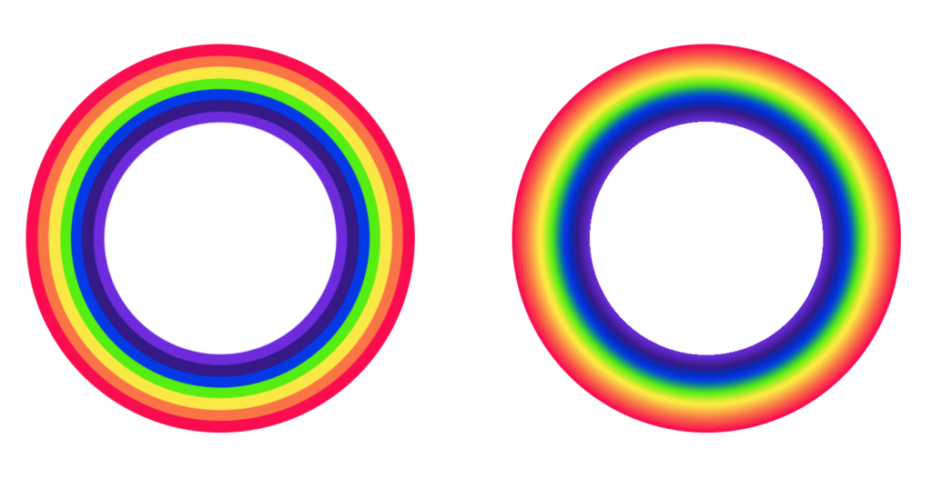
Each of the gradient rings above have 9 colour stops. The first colour is transparent, then we show the 7 colours of the rainbow and finish on transparent again. We will position each of our colour stops dynamically so that we can fine tune the appearance of our rainbows afterwards.
You will notice that the first rainbow ring (left) comprises 7 distinct solid colour bands and the second rainbow ring (right) is a more traditional gradient. Both of these styles can be created with radial gradients by tweaking the colour stop values.
A simple radial gradient in CSS looks like this:
.myGradient {
  width: 200px;
  height: 200px;
  background: radial-gradient(
    circle at center,
    transparent,
    red
  );
}
You can include as many colour stops as you want. By default, each colour will fill an even proportion of the gradient. The distance each colour occupies can be adjusted as follows:
.myGradient {
  width: 200px;
  height: 200px;
  background: radial-gradient(
    circle at center,
    transparent 0px,
    red 50px
  );
}
This demonstrates the basic principle of creating a smooth gradient. But what about bands? The trick is that colour stops can occupy the same distance from the centre to define a hard border between colours:
.myGradient {
  width: 200px;
  height: 200px;
  background: radial-gradient(
    circle at center,
    transparent 0px,
    transparent 50px, /* This sets the end of our transparency */
    red 50px
  );
}
This theory can be extrapolated to create both styles of gradient we need for our rainbows.
Step 7: Generating CSS Gradients
Instead of hard-coding both of our rainbow styles we will generate them using some more SCSS language features. Our logic will be as follows:
- Create a base gradient variable that we will append colours to.
- Loop over each colour and add it to our base gradient.
- If we’re generating a banded rainbow, add colour stops.
- Export our gradient as a CSS background
Each of the following code snippets will need to be added inside of our rainbowGradient mixin.
First of all we need to define our base gradient. This will look very similar to the last coded example above except we will use some of the variables we have already defined. This will ensure that our rainbows can be adjusted more easily in future:
// Base gradient
$rainbow-gradient:
  circle at center,
  transparent,
  transparent $rainbow-radius - $rainbow-thickness,
  nth($rainbow-colours, -1) $rainbow-radius - $rainbow-thickness;
Lines 2 to 4 of this code set up our radial gradient properties, setting the inner-most colour to transparent.
Line 5 of this code snippet defines the inner edge of our rainbow by factoring in the radius of the total rainbow minus its thickness.
Line 6 of this code snippet defines the first colour in our list of rainbow colours and sets its colour stop distance to be the same as the inner edge of the rainbow. The nth() SCSS function used here selects a value from our $rainbow-colours colour list at a given index (location in the list). The value -1 means that we take the value at the end of the list first (violet) because we are working inside to outside.
The purpose of this variable is such that we can now add each of our rainbow colours to it in turn with a loop. Loops work by iterating over a list of items. We will loop over each colour in our $rainbow-colours list variable in reverse order, appending them to our gradient as we go.
Our loop is defined as follows:
// Generate banded or smooth radial gradient
@for $i from 1 through length($rainbow-colours) {
  // We will add our gradient generation code here!
}
Mae'r @for directive is used to define a for loop in SCSS. A for loop is used to iterate over items in a list one at a time. In this case this loop will run 7 times, from item 1 to 7, the length of our $rainbow-colours list. The $i variable will store the current index of the list (1-7).
Inside our for loop we will store the colour value of the next colour like so:
// Next colour
$colour: nth($rainbow-colours, -$i);
Remember, we use the minus symbol here because we are working backwards through the list. On every iteration through the loop the value of $i will increase by 1 so we can achieve what we want by negating it.
Now that we have the next colour we can append it to our gradient like so:
// Start of band
$rainbow-gradient: append(
  // First we add the gradient we have already generated
  $rainbow-gradient,
  // Now we add the next colour
  $colour $rainbow-radius - ($rainbow-thickness -
    if(
      // If we are generating a smooth gradient...
      $type == "smooth",
      // Smooth: Offset the band start by half a band for better blending
      $colour-band-width + ($colour-band-width / (length($rainbow-colours) )),
      // Else if we are generating a banded gradient...
      // Bands: Do not offset the band
      $colour-band-width
    ) * ($i - 1)
  )
);
This code snippet appends the next colour to our $rainbow-gradient variable. The first 6 lines should be fairly straight forward as we repeat the same basic logic we used to define the $rainbow-gradient variable. Line 2 uses the append() SCSS function which can be used to add values to a list. Note that on line 4 we specify the variable we are appending to. What follows from line 7 onwards is an adjustment to the distance of the band we are appending.
In SCSS, an if() statement is a function that takes 3 comma separated arguments:
- An expression
- What to do if the expression is true
- What to do if the expression is false
In this case we want to determine what sort of gradient we are generating: bands or smooth. The first argument of our if() statement is a check for the $type variable we passed into our mixin. This type can either be smooth or bands. Therefore our if() statement evaluates to true if the type of gradient we are generating is smooth and evaluates to false if the gradient type is bands. This statement allows us to conditionally render either type of gradient.
The code from line 7 to 16 accounts for an offset that is necessary for each gradient type. In order to show the correct amount of colour for type smooth we have to add an offset of half the width of the band.
Next, if we are generating a rainbow of type bands we need to add an extra colour stop to produce hard borders between colours, as shown in step 6.
At the end of your for loop, add the following code:
// End of band (only use this for type == band)
@if($type == "bands") {
  $rainbow-gradient: append(
    $rainbow-gradient,
    $colour $rainbow-radius - ($rainbow-thickness - $colour-band-width * $i)
  );
}
This code should look familiar by now. This code only executes if the $type argument passed to this mixin is bands. Line 5 is the important part that adds an extra colour stop to produce the hard colour border that we need.
Our loop is complete. To complete the mixin all that’s left to do is export our radial gradient as a CSS background. To do this, add the following line at the bottom of the mixin body:
background: radial-gradient($rainbow-gradient);When we include this mixin into our rainbow CSS element, this CSS property will be injected. It defines a CSS cefndir consisting of a radial gradient with our generated $rainbow-gradient variable.
Step 8: Rainbow Rendering
It’s finally time to see our rainbows on the screen. We’ve written all of the code we need to generate both types of rainbow we need and now it’s time to see the results of all that code.
We are going to create another mixin which will contain the element which will hold our gradient:
// the rainbow element
@mixin rainbow($type) {
  &::before {
    content: '';
    position: absolute;
    width: $rainbow-diameter;
    height: $rainbow-diameter;
    filter: $rainbow-filter;
    opacity: $rainbow-opacity;
    border-radius: 50%;
    @include rainbowGradient($type);
  }
}
This mixin exports a CSS ::before pseudo element which has various properties set to it based on the variables we defined earlier. The border radius property on line 10 ensures that our rainbow is perfectly rounded. Line 11 includes our rainbowGradient() mixin and passes the type of rainbow along to it.
That’s it for our mixins. Let’s create the CSS for the elements we added to our HTML way back in step 2. To refresh, each of our rainbows has 2 class names, the first is enfys so let’s write the CSS for that first.
In CSS, class names are prefixed with a period: . so our class selector looks like this: .rainbow:
// Rainbow container
.rainbow {
  // Rainbow CSS properties here...
}
Add the following properties to your rainbow class:
width: $rainbow-diameter;
height: $rainbow-radius;
margin: 0px;
position: relative;
overflow: hidden;
This creates a rectangle the width of our rainbow but more importantly half of its height so that only the top half will be visible, resulting in the semicircular rainbow shape. overflow: hidden ensures that the other half of the rainbow will not be seen.
Next we need to address each of our other class names that appear in our HTML: bands a smooth. Add the following code underneath the code above:
// Rainbow classes
&.bands { @include rainbow("bands"); }
&.smooth { @include rainbow("smooth"); }
This code creates the following 2 selectors:
.rainbow.bands {}.rainbow.smooth {}
Each include our rainbow() mixin with the corresponding rainbow type set as the only argument.
If you did everything right, you will now see 2 rainbows on your screen!

But there’s one missing ingredient…
Step 9: Animation
All that’s left to do now is to create our animated rainbow reveal effect. The basic premise is that we will create a rectangle that starts off obscuring our rainbows which has the same background colour as our page. It will then rotate around the bottom centre of our rainbow to reveal what’s underneath.
Add the following at the bottom of your .rainbow {} declaration block:
// Animation element
&::after {
  content: '';
  position: absolute;
  transform-origin: $rainbow-radius $rainbow-radius;
  width: $rainbow-diameter;
  height: $rainbow-radius;
  background-color: $background-colour;
  animation: wipe $animation-duration ease-in-out infinite;
}
This is another CSS pseudo element (::after) which creates the rectangle over our rainbows.
Line 5 sets the transformation (in this case rotation) origin of the rectangle to be the centre of our rainbow. Line 9 sets the animation for our reveal which we will create shortly. The animation is set to have a duration equal to whatever is set in our $animation-duration variable. It will run infinitely with the ease-in-out animation timing function.
Add the following code after your .rainbow {} declaration block.
// Wipe animation
@keyframes wipe {
  0% { transform: rotate(0deg); }
  20% { transform: rotate(180deg); }
  70% { transform: rotate(180deg); }
  90% { transform: rotate(360deg); }
  100% { transform: rotate(360deg); }
}
Our animation is defined with the SCSS @keyframes directive and consists of 5 separate keyframes:
- Start off positioned over our rainbows at 0 degrees.
- After 20% of the animation the rectangle will be out of sight.
- After 70% of the animation, begin to hide the rectangle again.
- After 90% of the animation the rainbow will be hidden.
- The final 10% of the animation is a pause before starting over.
That’s it!
You can now begin to experiment with the variables we defined and work out what each of them is doing. See what sorts of rainbows you can come up with.
The full code for this tutorial is available on CodePen.
If you enjoyed this exercise, here are some resources you might like:
 Cymraeg
 ") English (UK)
English (UK)
2 replies on “Pure CSS Rainbows”
Hello Peter thank you a lot for the tutorial exactly what i need but i still run into a problem with my usecase… I would like to build a black and white Rainbow Menu where each line (Bow) will change the color on hover and contains a link. Could you help me out with this? I would offer you some money in exchange.
Hi Liam, with the way this demo works, it would be more difficult to make each individual ribbon of the rainbow change colour if you were to hover over it. You would need to create rings (circles) with increasing (or decreasing) radii instead, one for each colour. The solution I present creates one rainbow element, instead of the 7 you would require (+ one central element to obfuscate the inner portion of the rainbow) if you were to create interactive ribbons.